Project
Scryla
Classification
Digital marketing, blogposts, editorial, typesetting & hierarchy based media
Description
Scryla is a CTO consultancy operating in the UK.
During my time at Dawn, I was involved in the brand execution, designing blog post thumbnails, large documents in the Scryla style and digital marketing, creating social post sets.
This was another exercise in well-treated type, and utilising colour and pattern to maintain the identity of Scryla, and get across a message in an effective, attention-grabbing way.
Outcome
︎︎︎ Digital marketing
︎︎︎ Digital design
︎︎︎ Execution of brand identity
︎︎︎ Editorial & typesetting
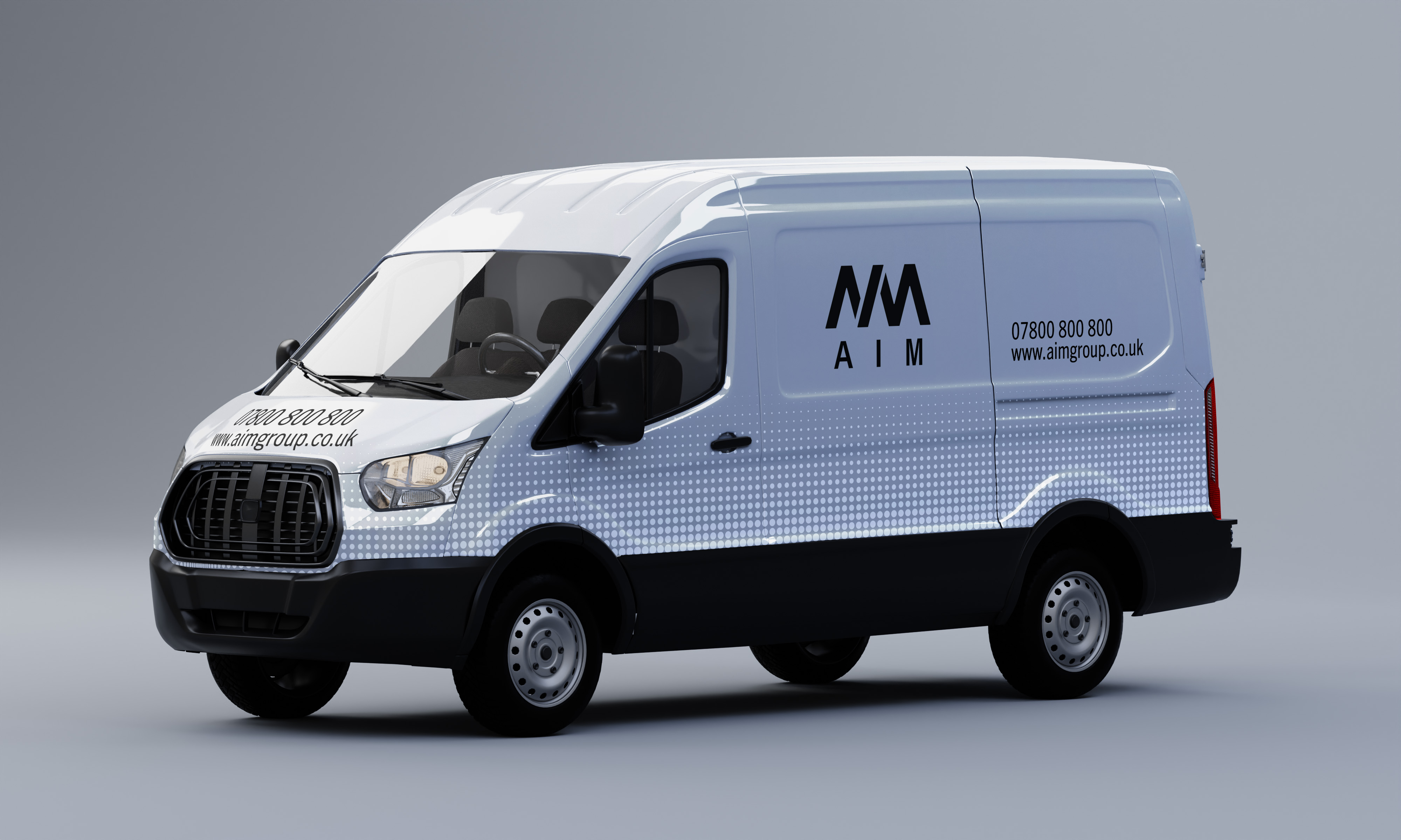
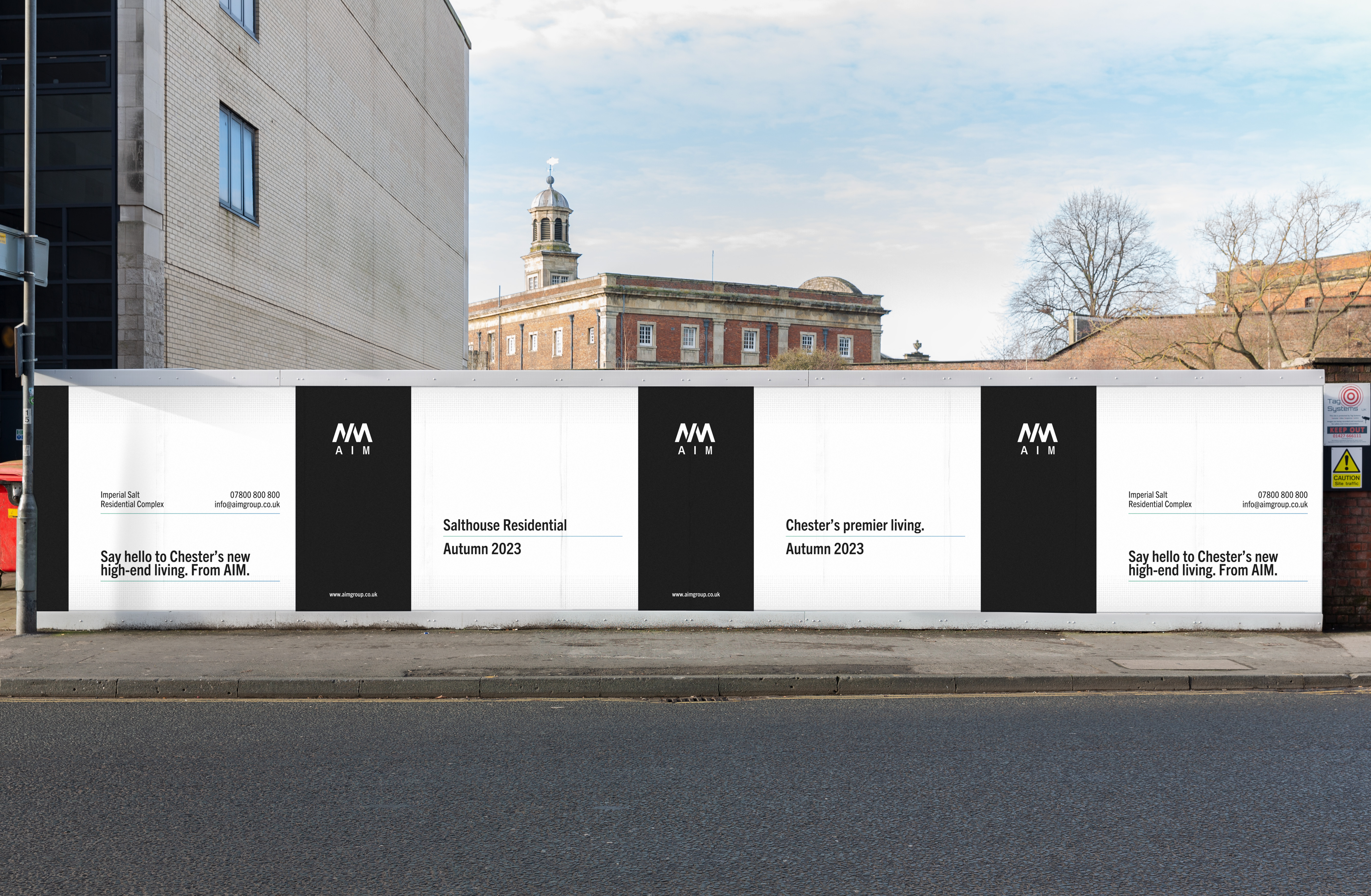
︎︎︎ Livery
Any construction company needs a good livery. AIM’s livery aims to stand out on site, and reinforce the image of a high-end, high-quality company.
Any construction company needs a good livery. AIM’s livery aims to stand out on site, and reinforce the image of a high-end, high-quality company.

︎︎︎ Letterhead
The AIM letterhead once more uses the AIM Dot pattern subtly to create something akin to a gradient. The typeface, Trade Gothic, allows for the copy to appear modern, classic and high end simultaneously.
The AIM letterhead once more uses the AIM Dot pattern subtly to create something akin to a gradient. The typeface, Trade Gothic, allows for the copy to appear modern, classic and high end simultaneously.
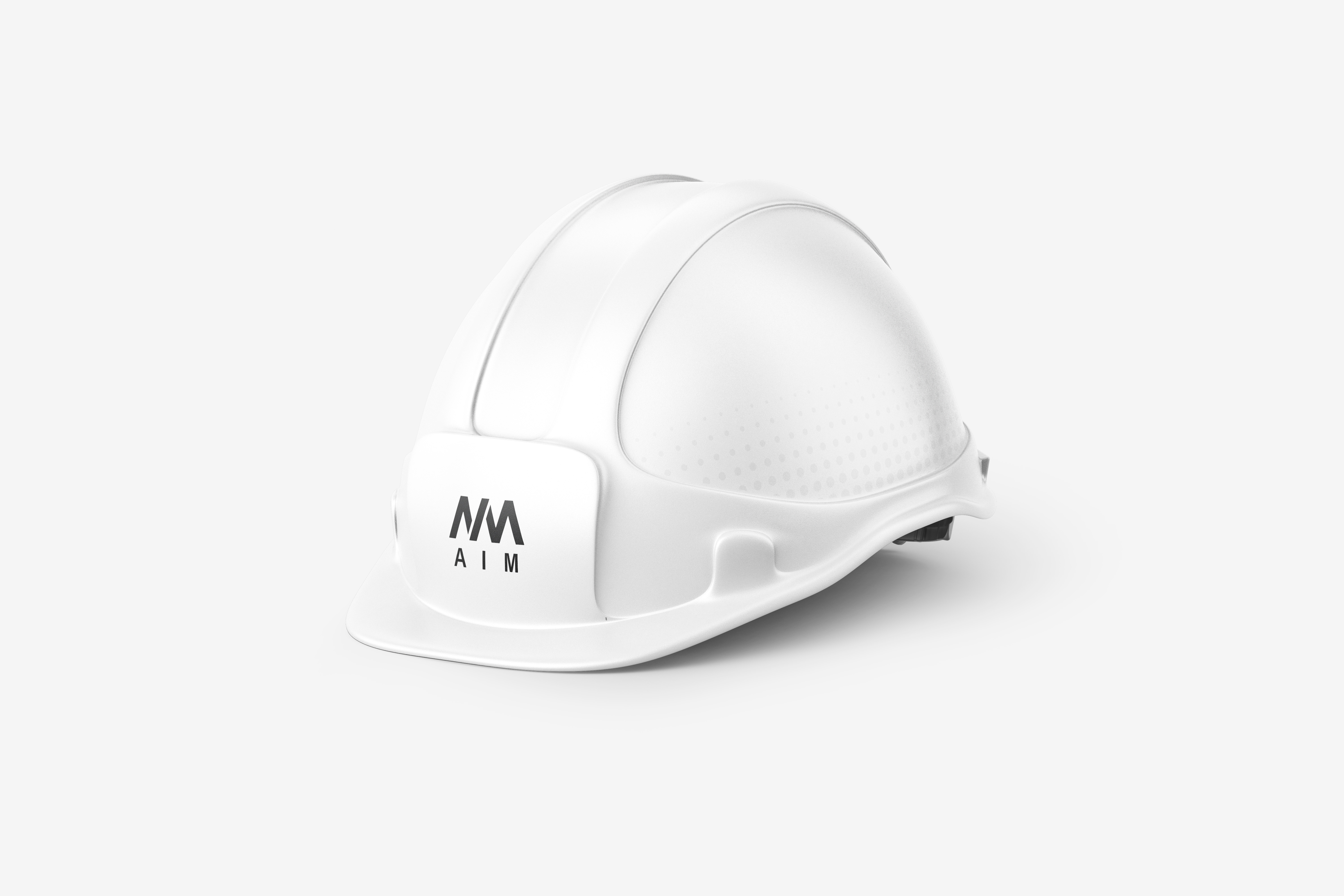
︎︎︎ Hard hat
AIM’s signature AIM Dot in action here, adorning the sides
of the hard hat without being imposing, allowing the logo
to breathe and take centre stage.
AIM’s signature AIM Dot in action here, adorning the sides
of the hard hat without being imposing, allowing the logo
to breathe and take centre stage.