Project
Apiary
Classification
Brand identity, creative direction, web design,
layout, printmaking, photography, packaging design
Description
Apiary is a beekeeping produce store with two aims:
to provide ethically sourced beekeeping produce with
natural health benefits including (but not limited to) honey, pollen, nectar, propolis, and to bring beekeeping as a skill
and interest into the mainstream for younger audiences.
Apiary required a dynamic, adaptive labelling system for
its produce. The system I came up with through multiple iterations was a simple, eyecatching series of labels that change based on the container, yet retain a distinctive, uniform brand identity.
Another outcome was the apiary posterzine, designed
as a series of collectable zines that fold out into posters with beekeeping-themed designs. I set up silk screens and hand-printed multiple copies of the first issue, allowing for a tactile feel in-hand, with an alluring A1 poster on the back.
Outcome
Brand Identity & Strategy
Website
Posterzine
Packaging
Website, Video
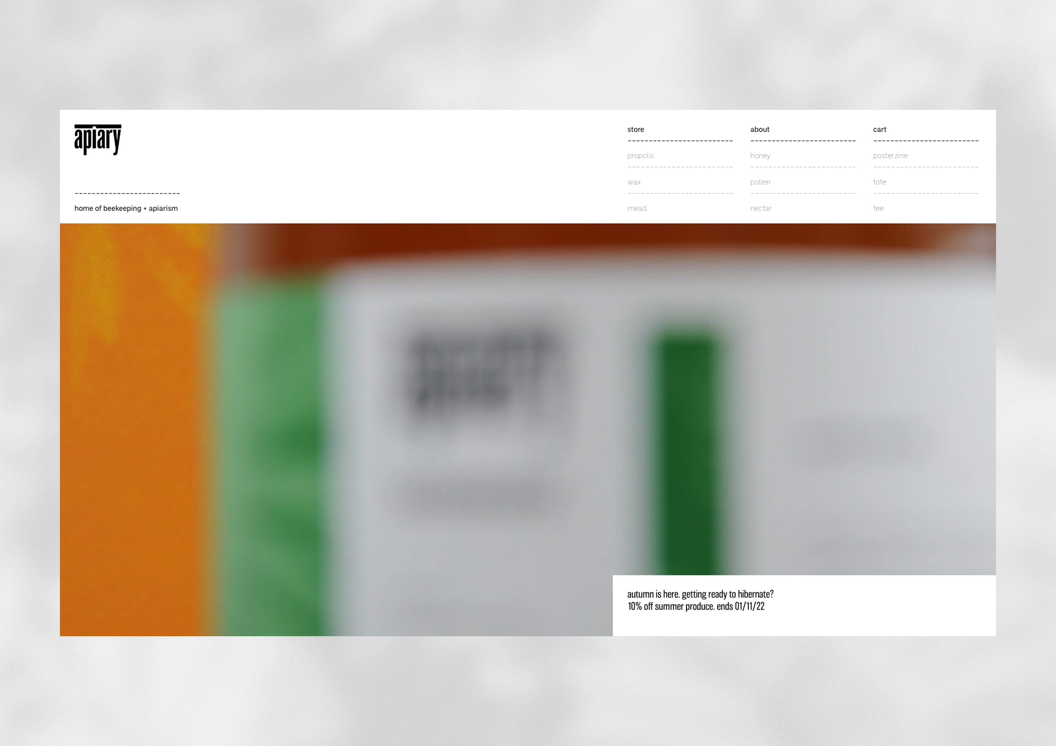

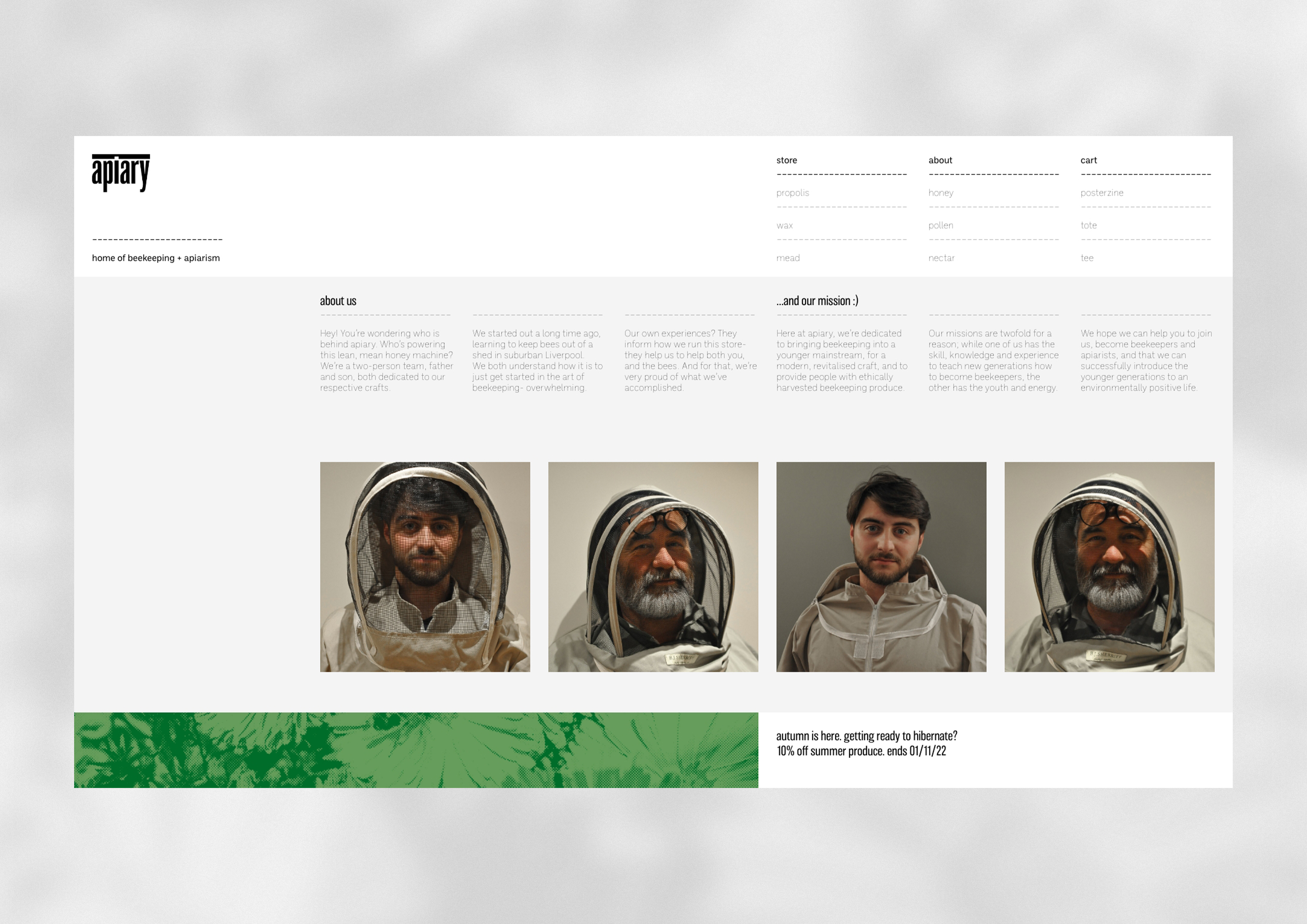
Apiary Website
Home, Product, About
Home, Product, About
Posterzine
Details, Texture, Colours
Details, Texture, Colours
Posterzine, GIF
All photography was taken by me. The prototypes were actually created through a series of iterations, and utilised real produce to allow for an idea of how it would look as an end product.
Labelling, wax bar and honey jar
Uniformity between products
Uniformity between products
Products,
Honey, tote, posterzine, pollen, mead and wax. While they work really well together, they’re also
capable of standing out when on their own.
Honey, tote, posterzine, pollen, mead and wax. While they work really well together, they’re also
capable of standing out when on their own.
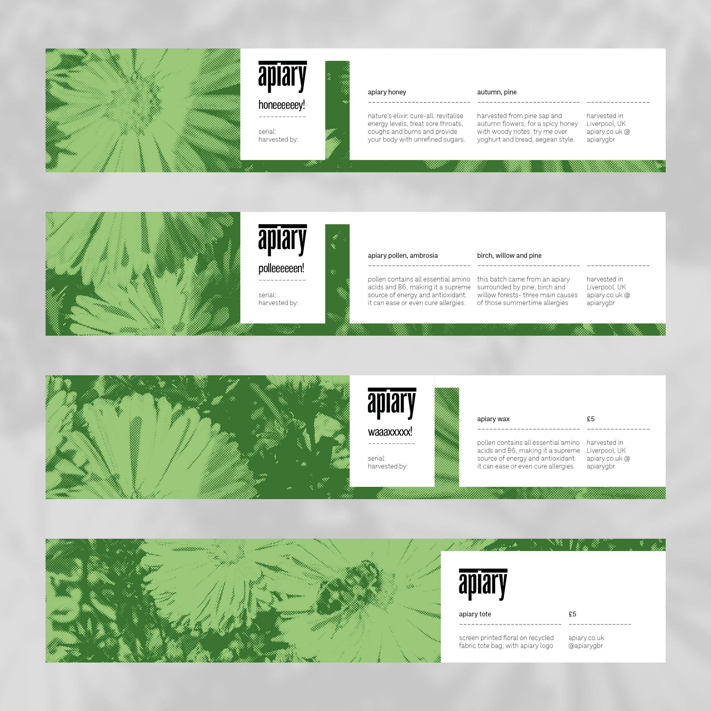
Labelling, flats
Adaptable system.
New labels can easily be designed.
Adaptable system.
New labels can easily be designed.
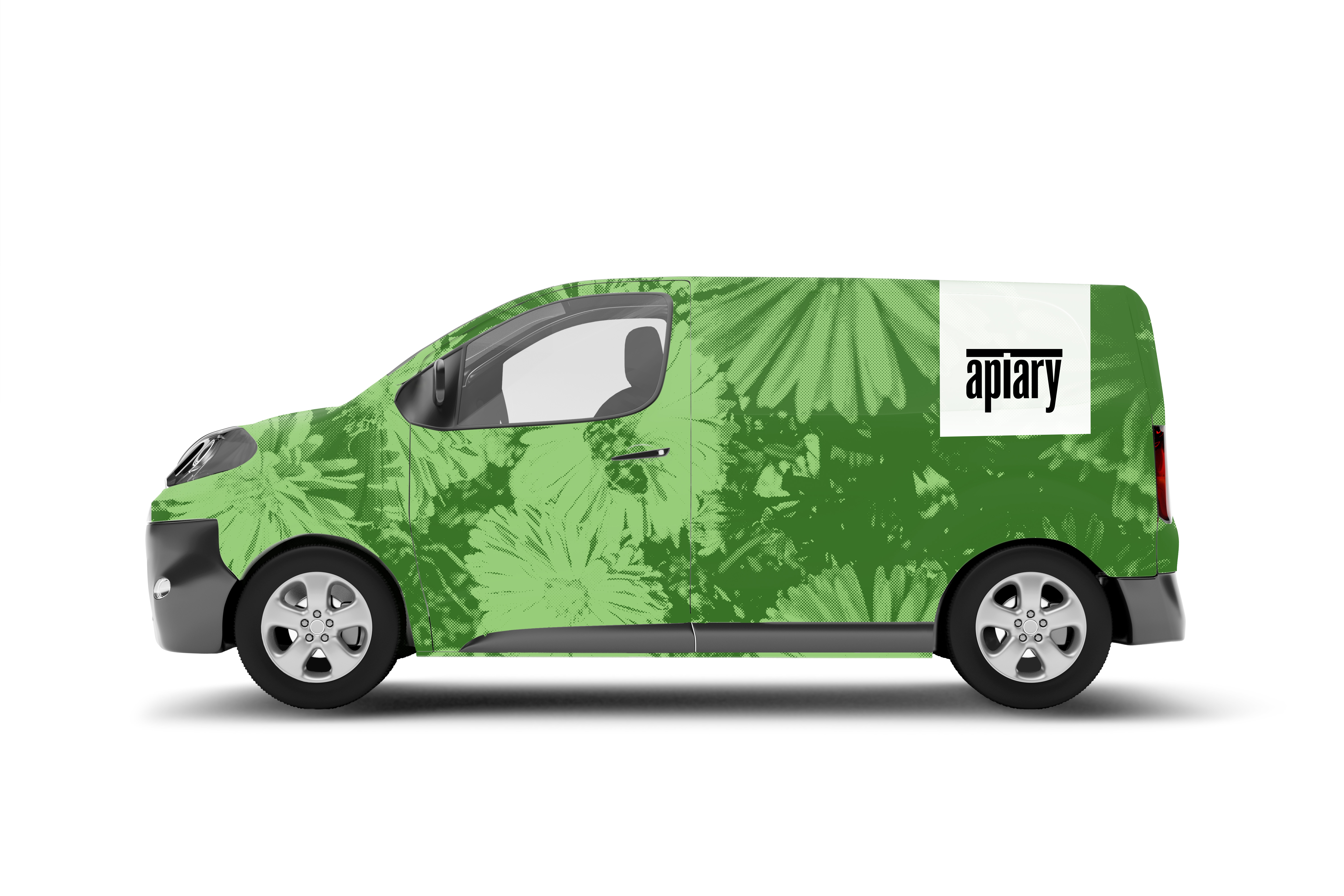
Apiary delivery van
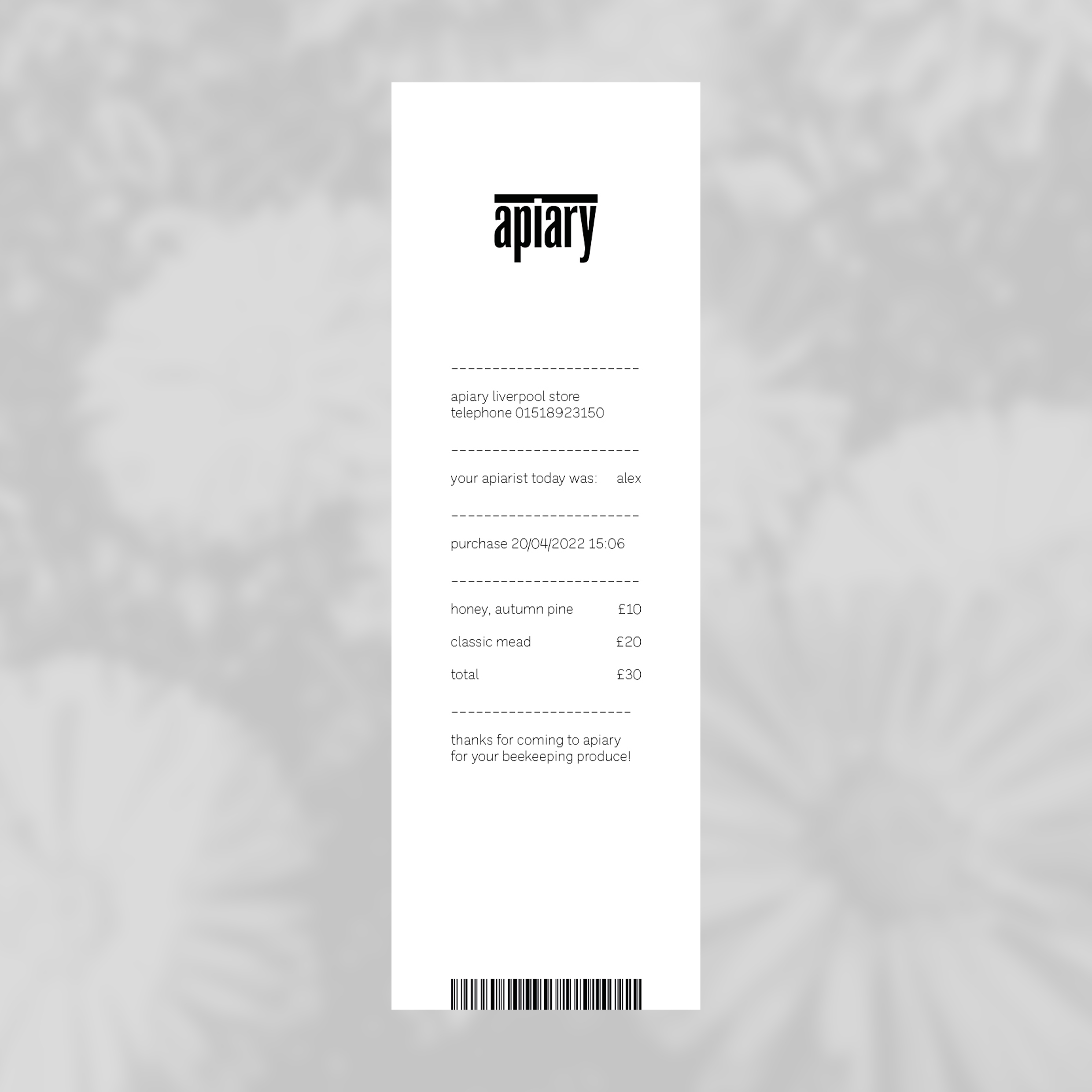
Receipt. Branding in action.