Project
Birchdale
Classification
Brand identity, logo design, typesetting + typography
Description
Birchdale Vending wanted a new brand, on a small scale.
They were looking to present themselves as suppliers of reliable, well-built, mid to high end modern vending machines that simply put, “do the job”. Part of the brand of Birchdale is the emphasis on providing quality service, consistent maintenance and fast outcomes for clients and customers.
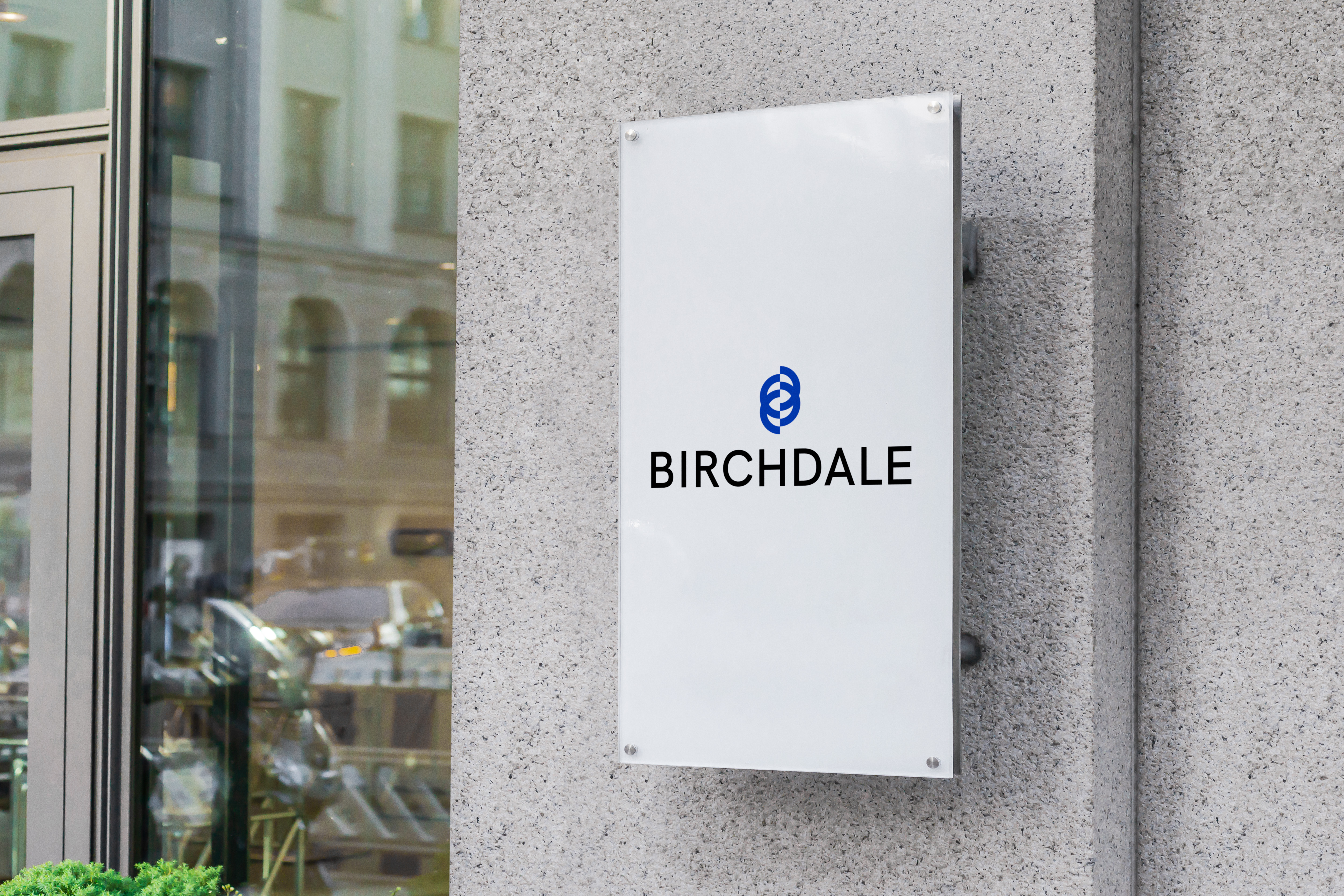
The outcome here was an abstract logo marque, representing the letter B while also reminiscent of a classic vending machine part, the spiral, which dispenses the food or drink you choose.
The type of the lockup utilises Hanken Grotesk, with a wide tracking and slight outline editing to build relationships between the logo marque and letter marque.
Outcome
Brand identity
Brand presentation
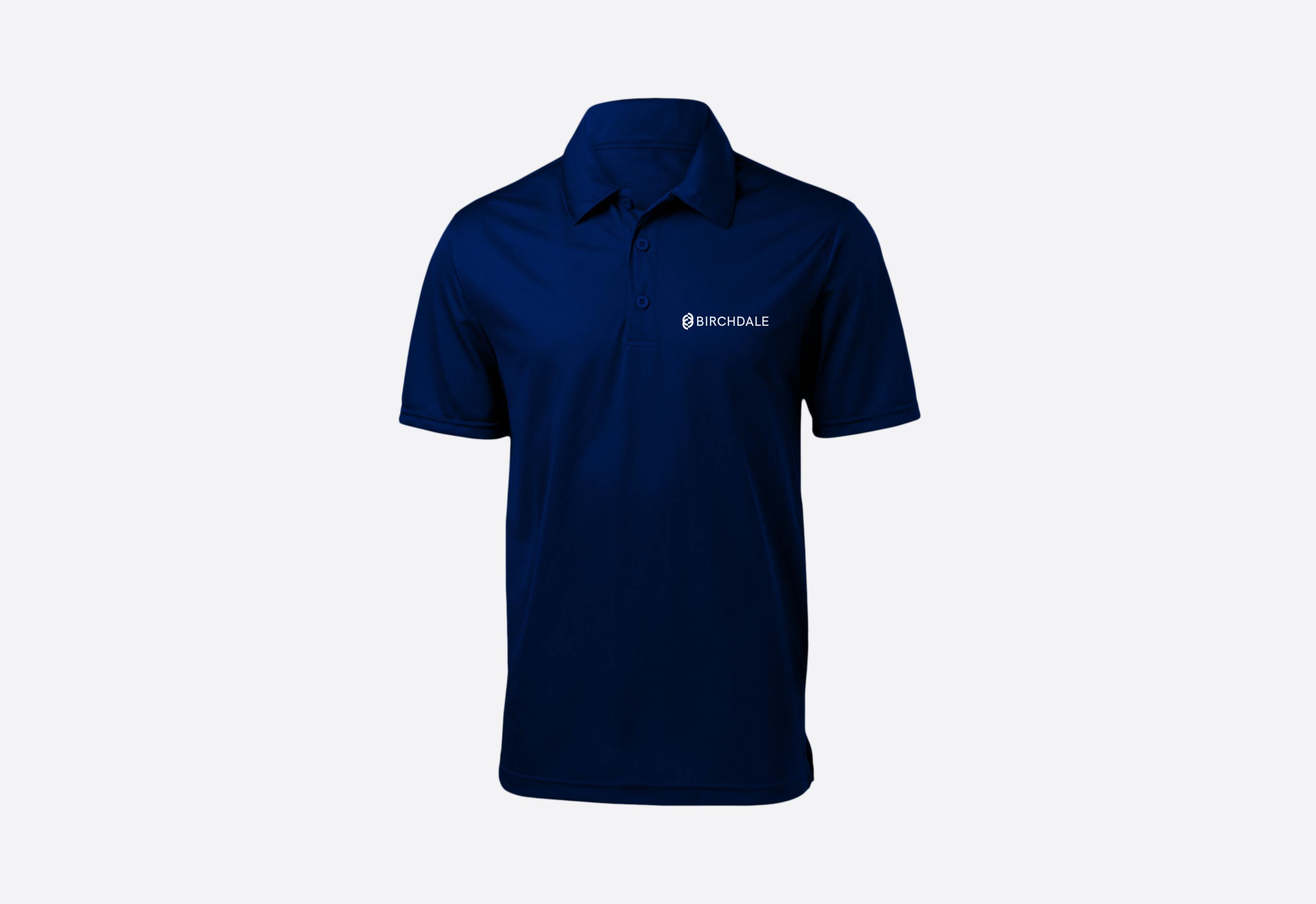
Uniform
The idea behind the Birchdale rebrand was to bring the logo into the modern era, and use an abstract letterform marque to provide some evolution on their old branding (a large B encapsulated in an oval).
My response was to create an abstract ‘B’ mark which looks similar to the typical vending machine spiral; providing a two-prong abstract strategy to appeal to modern customers.
D
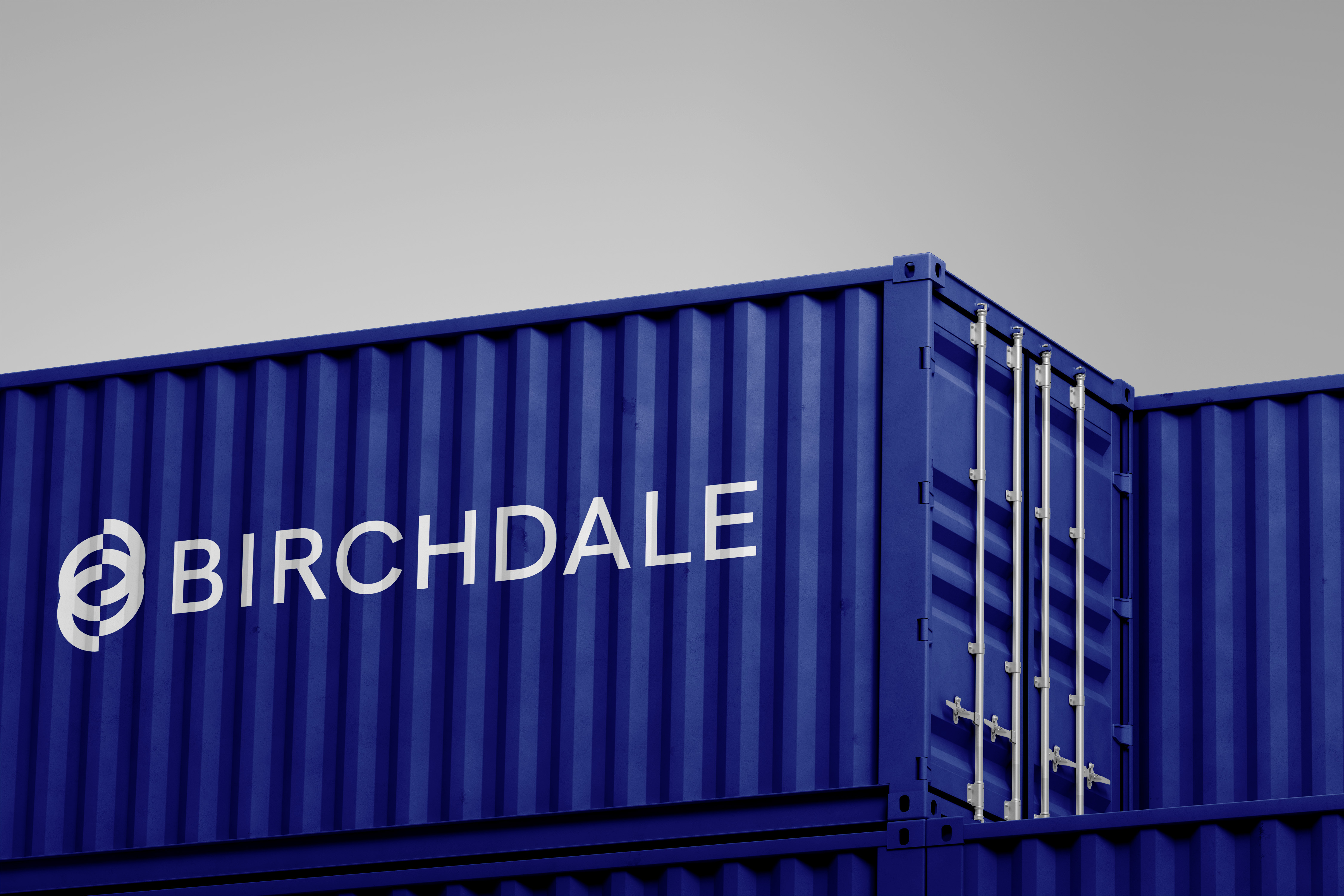

︎︎︎ Environmental applications
Also key part of the brief is the fact that the company would be applying its branding on many surfaces- from stickers on the vending machines, to storage for existing, not in use machines. It was as such, important that the logo have a horizontal and vertical lockup, and be legible in small and large sizes- for small stickers, and big decals.
Also key part of the brief is the fact that the company would be applying its branding on many surfaces- from stickers on the vending machines, to storage for existing, not in use machines. It was as such, important that the logo have a horizontal and vertical lockup, and be legible in small and large sizes- for small stickers, and big decals.