Project
Joseph Holt, 175th Anniversary
Classification
Brand identity, campaign identity, logo design, digital marketing, campaign concept, conceptual thinking, typesetting & typography, POS, FMCG, illustration
Description
Concept presentation for Joseph Holt’s 175th anniversary. Creation of a sub-brand for this campaign and event, including a lockup inspired by and utilising elements of the Joseph Holt branding, and palette. Creation of POS and FMCG assets utilising the campaign identity and finally, digital marketing assets for promotion and release of the Joseph Holt 175 logo.
Outcome
︎︎︎ Campaign concept
︎︎︎ Campaign identity
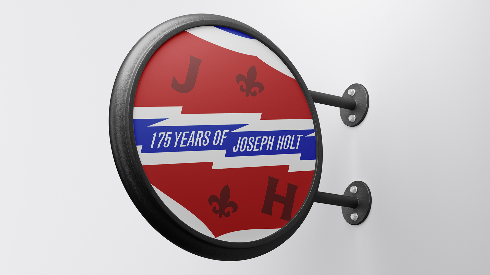
︎︎︎ Campaign POS + FMCG labels
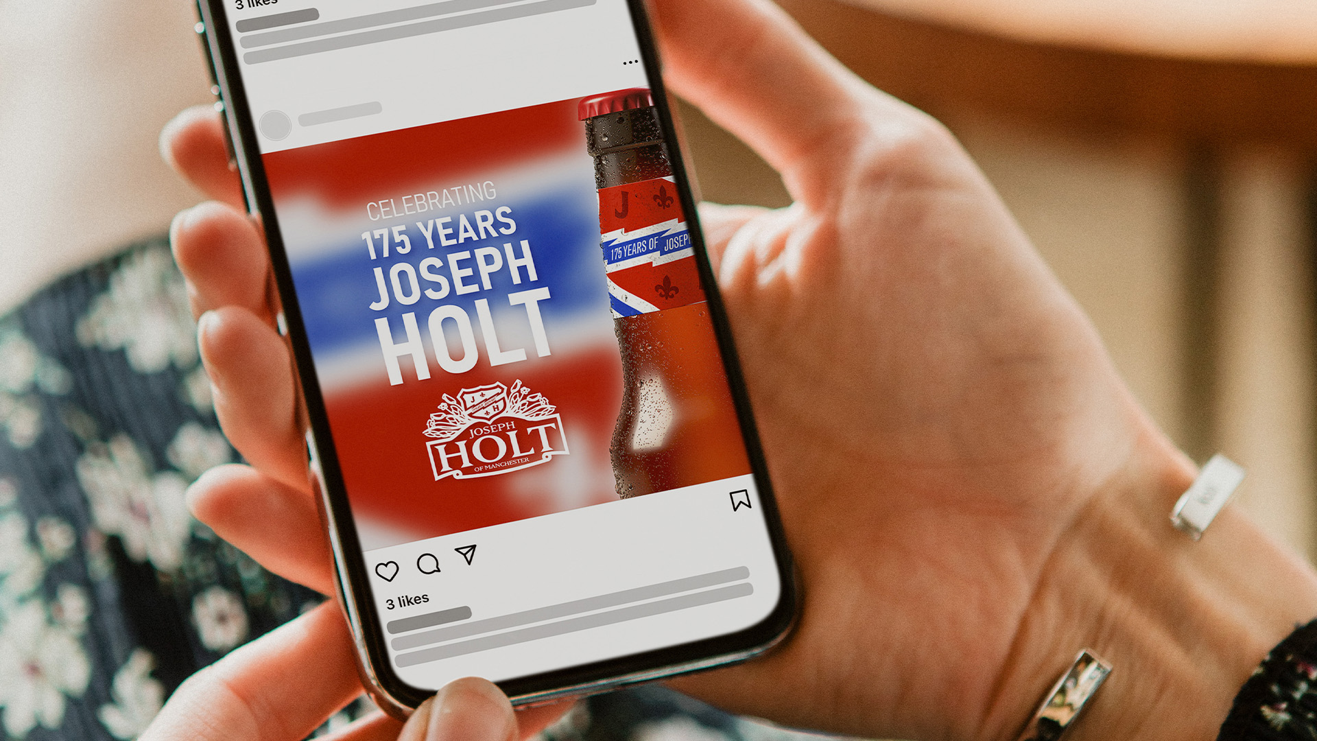
︎︎︎ Digital marketing
︎︎︎ Illustrative graphic elements

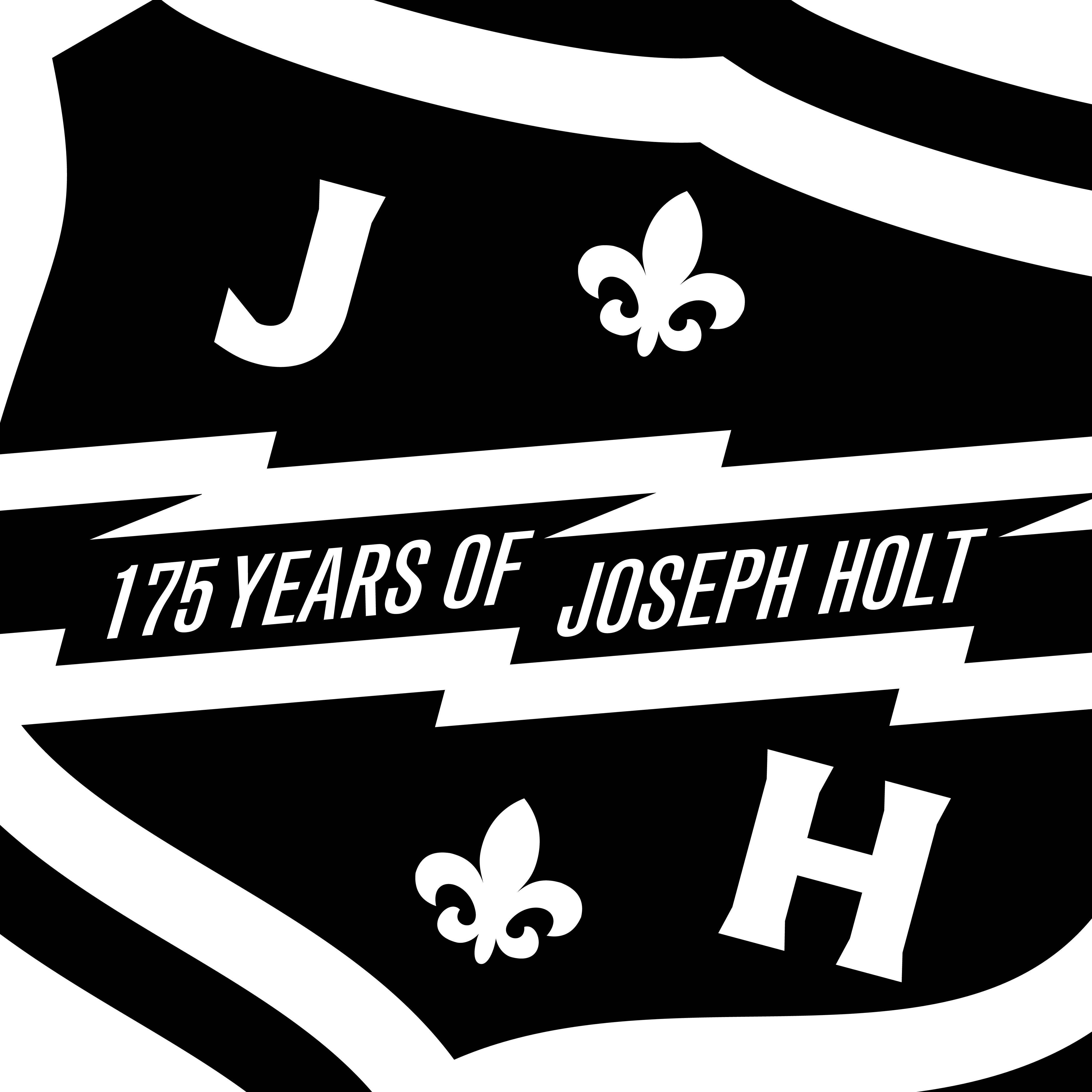
Taking inspiration from Michael Bierut and Pentagram’s work on Saks Fifth Avenue and the Brooklyn Academy of Music. A lockup that’s designed to be just too big for the area it sits in; evoking a sense that this is a heritage brand, a big, established brand, and that it’s full of energy... and can’t be contained.
Part of this brief was that the owners of Joseph Holt, the Holt family, are really proud of the current logo, and wanted to use it somehow in the Holt 175th anniversary logo lockup. I analysed the current logo, and found that the main aspect, and the most important visually, is the family crest- a very heritage focused, proud and gallant graphic that had a lot of potential in a more digital form.
I also came up with the idea that as a campaign under Joseph Holt, it was important to look at it like a birthday party: you don’t rip the walls down and build a new house to celebrate; you put up banners and buy flowers.
This campaign’s lockup would be designed to sit within the normal Joseph Holt lockup for the time it runs- with subtle changes to appeal to diehard customers and eagle-eyed pub-goers... like a nice, heritage celebrating, simple and to the point banner put up, centre stage.


︎︎︎ FMCG and POS


︎︎︎ Digital Marketing
One of the main decisions in the campaign identity was to keep the Joseph Holt logo’s colours in play but bring them out a bit more and saturate them, which alongside the use of more clean lines and a thick white stroke, evokes a classic British heritage feel- an ideal thought to
play with at the time of the Royal Coronation, and a solid marketing tactic.